Frappik – Making Possible!
Project Overview
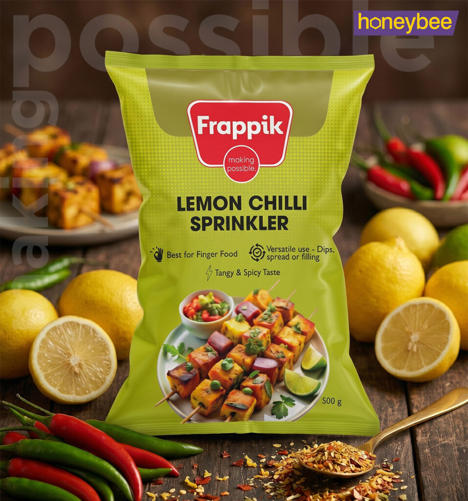
Originally launched as a frappe-centric brand with high growth potential, Frappik’s identity eventually lost its competitive edge, stalling consumer excitement and purpose. Over time, the brand image struggled to convey essential pillars like quality, reliability, aspiration, and value. Honeybee Design was tasked with reimagining Frappik’s brand identity and design strategy. The goal was to establish a stronger market foothold, drive penetration, and elevate brand perceptions as Frappik expands its legacy franchise into a comprehensive range of ingredients and food solutions for the food services business.
The Result
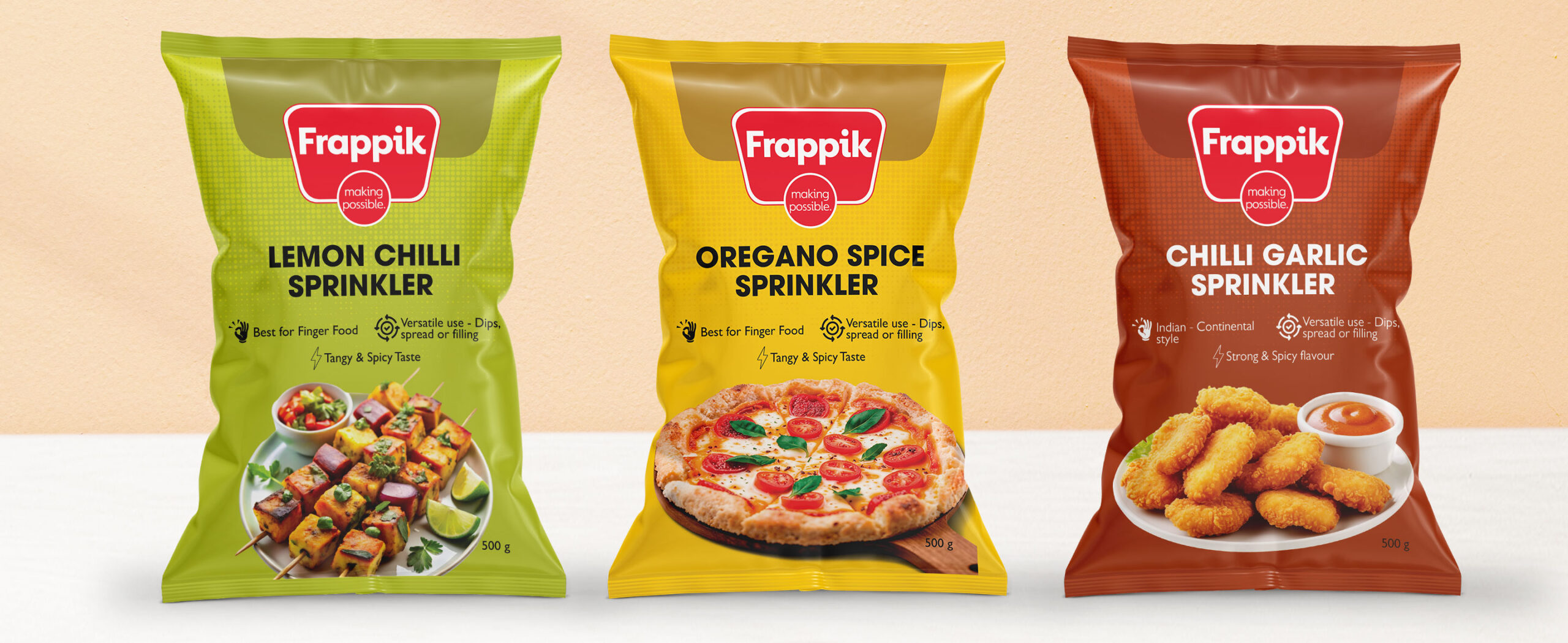
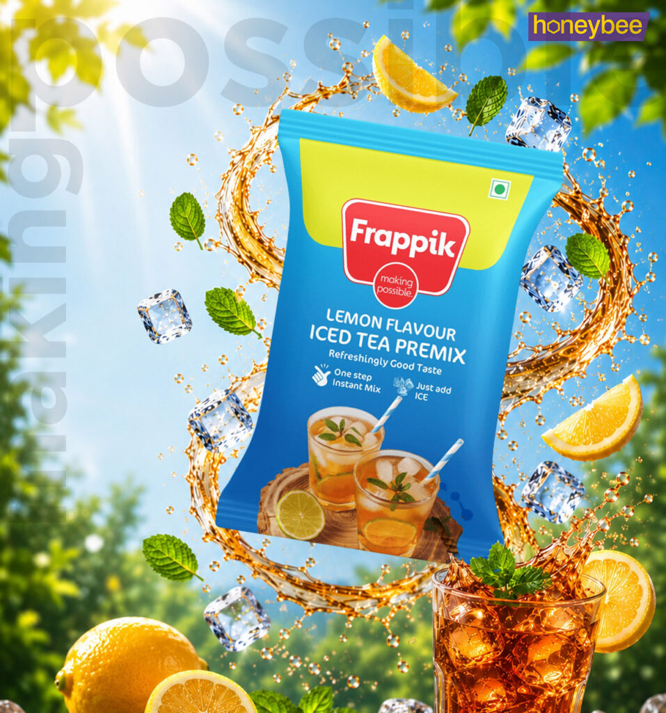
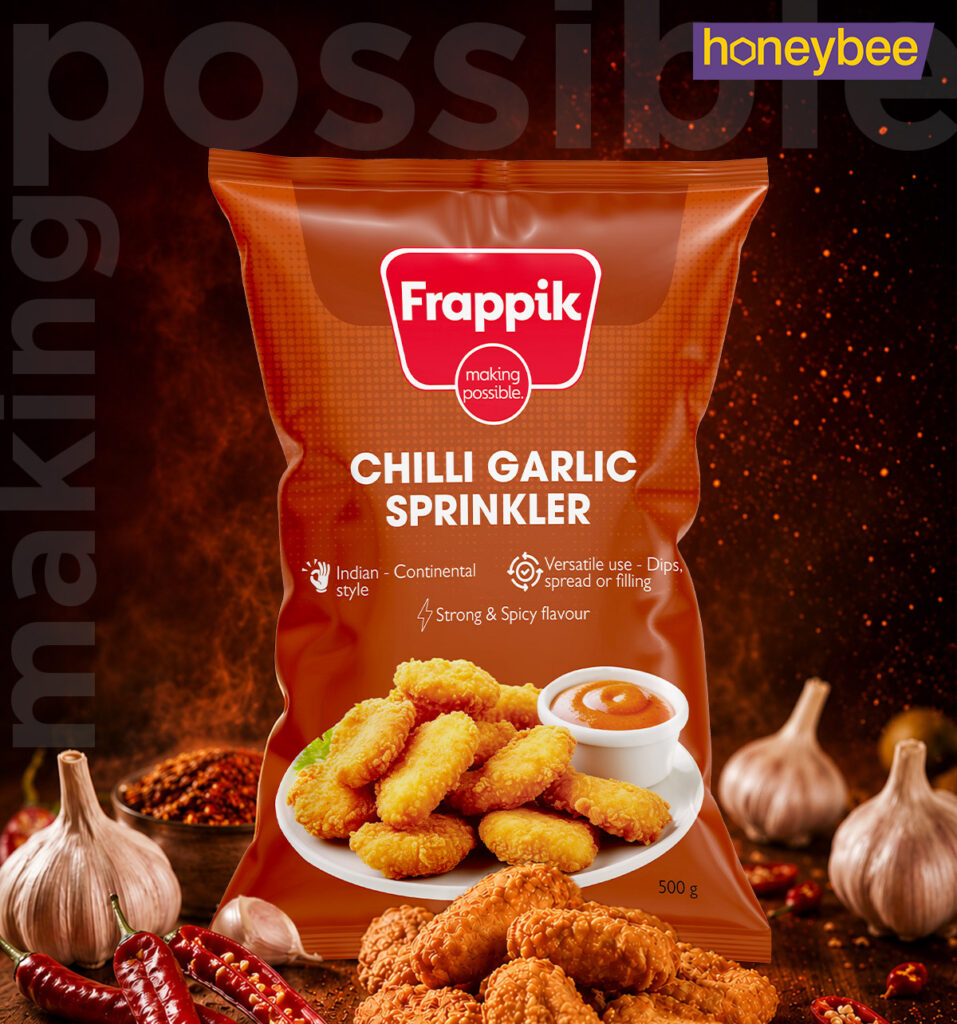
This intentional, B2B-focused brand redesign was engineered to cut through a cluttered food services market and captivate HoReCa clients. We introduced a clear, strategic positioning—“Making Possible”—that directly aligns the brand promise with the high expectations of QSR owners and chefs. The new visual identity is built on a bold, value-driven simplicity that emphasizes quality, reliability, and modern culinary perspectives. By utilizing a vibrant color palette, the packaging commands shelf presence. Simultaneously, a cohesive design architecture and structured grid system seamlessly accommodate an expansive, evolving product portfolio, ensuring effortless scaling for both existing lines and future new product developments (NPD).