
Uncategorized
The Invisible Downside of Overdesigned Packaging
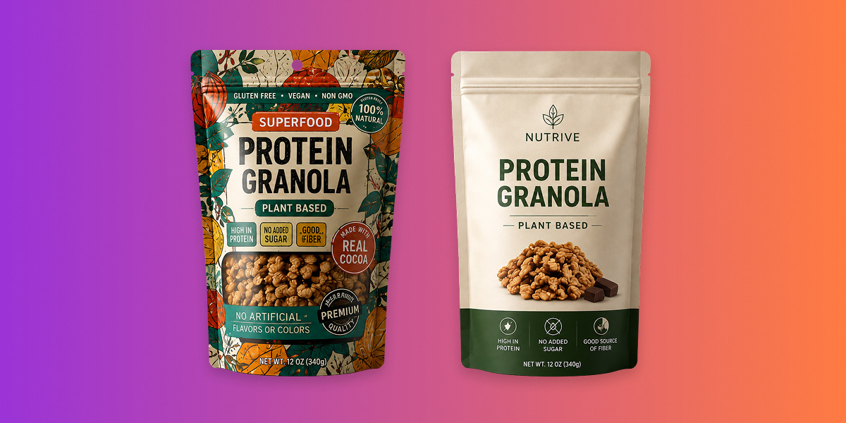
When a pack tries to say everything, the shopper hears nothing. The most expensive mistake in packaging is rarely too little design. It is too much. There is…
When a pack tries to say everything, the shopper hears nothing. The most expensive mistake in packaging is rarely too little design. It is too much.
There is a natural instinct, when a brand cares about a product, to give the pack more. More colour, more claims, more finishes, more badges, more story crammed into a surface the size of a hand. Every addition feels like added value. On the shelf, the opposite happens. Over years of designing for crowded categories, we have watched “more” quietly work against the very brands it was meant to lift, and the damage is hard to see precisely because it looks like effort.
Excess is a tax on the shopper’s attention
Recall the window the pack has to work in: under two seconds to stop a hand, inside a First Moment of Truth that lasts three to seven. The shopper is not studying the pack. They are scanning a wall of them, filtering fast, looking for a reason to stop. A busy pack does not reward that scan; it punishes it. When packaging is overloaded with information, shoppers do not lean in to decode it. They tune out and move to the next option that is easier to read.
This is the invisible downside. An overdesigned pack rarely announces its failure. It simply gets skipped, quietly, thousands of times a day, while everyone assumes the problem lies with price or placement. The cost is real revenue, and it never appears on an invoice.
Why “too much for too little” is the wrong trade
The logic of excess assumes that more elements mean more chances to persuade. Shopper behaviour says the reverse. Clarity, not clutter, is what converts in the decisive seconds. Pushing for too much on a pack usually buys too little in return, and often costs more to produce along the way. Three advantages follow directly from restraint.
- Sharper shelf impact: A clean, uncluttered pack stands out precisely because everything around it is shouting. In a noisy category, silence is contrast, and contrast is what gets noticed. The pack that breathes is the pack the eye lands on.
- Better usability: A simple layout makes the information that drives the decision – what this is, who it is for, why it is different – easy to locate at a glance. When the shopper can find what they need without hunting, the pack helps them choose. When they cannot, it makes the choice harder and loses the sale.
- Lower cost. Fewer elements, fewer special finishes, and fewer moving parts mean simpler artwork, simpler production, and fewer things to get wrong at the print stage. Restraint is not only better design; it is frequently cheaper design.
Overdesign disconnects the brand from its own audience
There is a subtler harm than being skipped. A pack overloaded with visual noise can drift away from the people it is meant for. Every extra flourish is a small decision about who the brand is, and enough of them, uncoordinated, blur the signal. The premium cue undercuts the value message. The playful illustration muddies the trust claim. The pack ends up saying several things at once and, as a result, nothing clearly. The shopper who might have belonged to the brand does not recognise themselves in it, and quietly passes.
Dilution of this kind is expensive because it erodes the one thing packaging is best placed to build: instant, repeatable recognition. A brand block that changes its mind on every SKU never becomes a shortcut in the shopper’s memory. A disciplined one does, and that shortcut is worth more with every purchase.
Restraint is a discipline, not a shortage of ideas
It is worth being clear about what “less” means here. Restraint is not the absence of design; it is the outcome of harder design. Deciding what to leave off a pack is more demanding than deciding what to add, because it requires knowing exactly what the pack must achieve and having the confidence to protect that from everything competing for space. The blank areas on a well-designed pack are not empty. They are doing the work of making the important things unmissable.
This is where a design-thinking approach earns its place. Rather than starting from what the brand wants to say, it starts from what the shopper needs to see, and builds back from there. The methodology enhances visual appeal, yes, but its real value is what it removes: the excess that would otherwise dilute the message. The result is a pack that performs better on shelf and connects more honestly with the person reaching for it.
The bottom line
The most costly packaging mistake is almost never austerity. It is abundance, the well-intentioned pile of elements that overwhelms the shopper, blurs the brand and quietly loses the sale in the two seconds that decide it. Before adding one more claim, badge or flourish to a pack, the more useful question is what could come off. Say less, and the shelf, at last, hears you.